Original studio concept
The Shape of Clear Thinking
Original studio concept — not a published client title.
Complexity, brought into a clear arrangement.
The title and cover are a studio design exercise, not a client manuscript or publication record.
Discuss Your CoverOriginal studio brief
The idea behind the cover.
An original nonfiction design exercise about visual clarity. The brief uses a small vocabulary of geometric forms and a deliberate type hierarchy to demonstrate a direct, legible cover direction.
A closer look
The thinking
in the artwork.
One yellow ground holds a circle, a square and a cut-out arch. Their different weights create a sense of order without looking like a diagram from a particular book. The lower title block remains readable even when the cover appears as a thumbnail.
- Design detail
- Original geometric construction
- Design detail
- Yellow, charcoal and cream
- Design detail
- A direct sans-serif hierarchy
Original writing and vector design for this Publishing Core Studio demonstration. This concept is not a published client title, and does not establish an author commission or retailer listing.
 View Project
Cover design project · Memoir
My Love Story Falling in Love with a Narcissist
 View Project
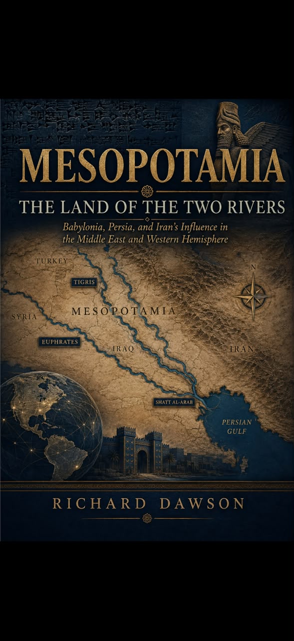
Cover design project · History
Mesopotamia: The Land of the Two Rivers
 View Project
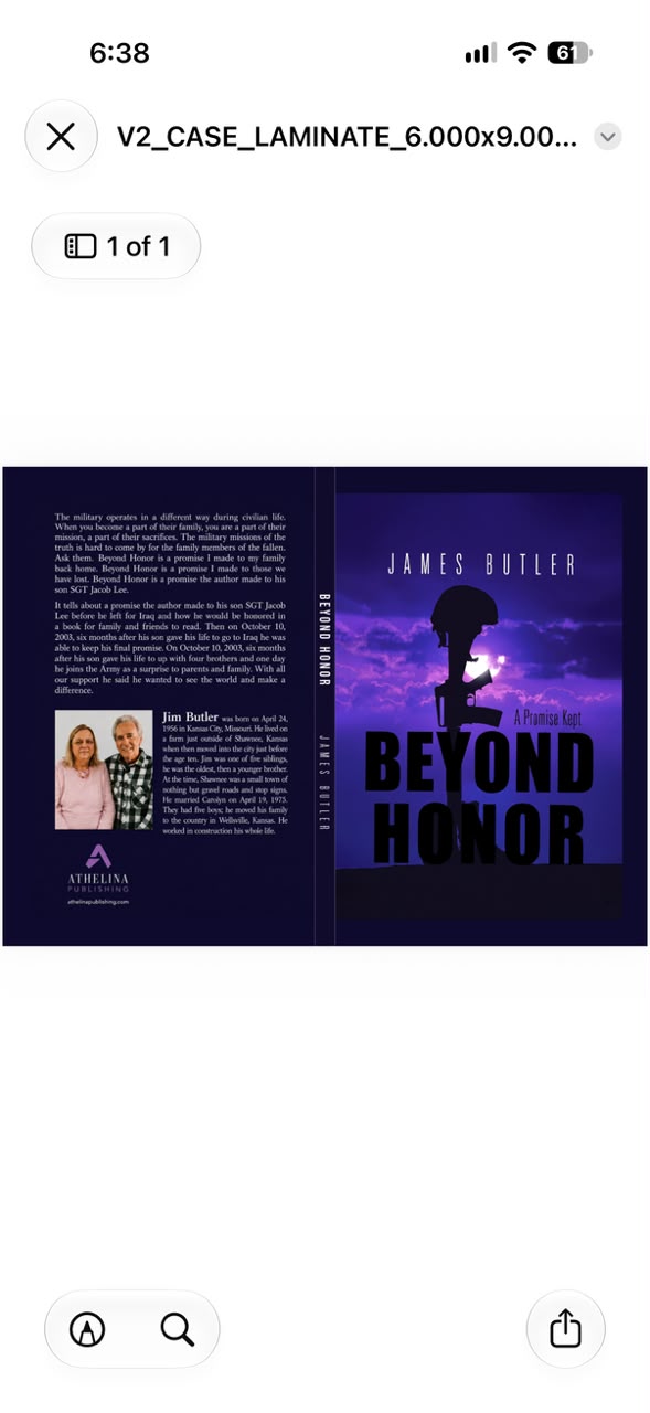
Cover design project · Military memoir